

When writing an app it is not enough only to have it work, sometimes a developer should make the extra mile and also improve UX. Users are engaged to an app only if they find it smooth and intuitive. Small view animations can be a great addition for users. In this tutorial, I will try to animate state transitions on the login and the signup screen with a transition between views itself as well.
Let’s start with adding a container view that will hold information which screen should be presented(login and signup)
struct ContentView: View {

    @State var loginShown: Bool = true

    var body: some View {
        VStack {
            renderScreenChooseView
                .padding(.bottom, 60)

            if loginShown {
                LoginView()
                    .transition(.insertToRight)
            } else {
                SignupView()
                    .transition(.insertFromRight)
            }

            Spacer()
        }
    }

    var renderScreenChooseView: some View {
        HStack {
            renderSingleChoseView(text: "Login", showIndicator: loginShown)
                .onTapGesture {
                    withAnimation {
                        loginShown = true
                    }
                }

            renderSingleChoseView(text: "Sign up", showIndicator: !loginShown)
                .onTapGesture {
                    withAnimation {
                        loginShown = false
                    }
                }

            Spacer()
        }
        .padding()

    }

    func renderSingleChoseView(text: String, showIndicator: Bool) -> some View {
        VStack {
            Text(text)


            if showIndicator {
                Divider()
                    .transition(.insertFromRight)
            }
            Spacer()
        }
        .frame(width: 80, height: 50)
    }
}
When we want to define a transition, we need also need to define a trigger for that transition, which, in our case would be a bool loginShown that will serve as a single source of truth which view should be presented. We have defined a custom transition that will serve to control how elements are shown on the screen. We will add two transitions(from left to right and vice-versa).
extension AnyTransition {
    static var insertToRight: AnyTransition {
        let insertion: AnyTransition = .move(edge: .leading)
            .combined(with: .opacity)

        let removal: AnyTransition = .move(edge: .trailing)
            .combined(with: .opacity)

        return .asymmetric(insertion: insertion, removal: removal)
    }

    static var insertFromRight: AnyTransition {
        let insertion: AnyTransition = .move(edge: .trailing)
            .combined(with: .opacity)

        let removal: AnyTransition = .move(edge: .leading)
            .combined(with: .opacity)

        return .asymmetric(insertion: insertion, removal: removal)
    }
}
On our login screen, we should have two text fields with separators and a login button at the bottom of the screen. For a login button, we will use a view modifier which will have a scale effect with opacity.
struct LoginView: View {
@State var username = ""
@State var password = ""
var isLoginButtonEnabled: Bool {
withAnimation {
!username.isEmpty
&& !password.isEmpty
}
}
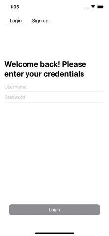
var body: some View {
VStack {
HStack {
Text("Welcome back! Please enter your credentials")
.font(.title)
.bold()
Spacer()
}
renderUsernameTextField
renderPasswordTextField
Spacer()
Button(action: {
}) {
Text("Login")
.frame(maxWidth: .infinity)
.frame(height: 40)
}
.padding()
.buttonStyle(AnimatedButtonViewModifier(isEnabled: isLoginButtonEnabled))
}
.padding()
}
var renderUsernameTextField: some View {
DividerTextField(text: $username, placeholder: "Username")
}
var renderPasswordTextField: some View {
DividerTextField(text: $password, placeholder: "Password")
}
}
Also, we have offloaded some logic to an external view which will add a separator after a text field. Also in the next lines a button view modifier can be found.
struct DividerTextField: View {
    @Binding var text: String
    var placeholder: String

    var body: some View {
        VStack {
            TextField(placeholder, text: $text)
            Divider()
        }
    }
}
For a button animation we will use a scale effect(button will grow bigger when pressed) and also opacity will be changed so it indicates an obvious user action and that something is happening on that press.
struct AnimatedButtonViewModifier: ButtonStyle {
    var isEnabled = true

    func makeBody(configuration: Configuration) -> some View {
        configuration.label
            .background(isEnabled ? Color.orange : Color.gray)
            .foregroundColor(.white)
            .cornerRadius(10.0)
            .opacity(configuration.isPressed ? 0.7 : 1.0)
            .scaleEffect(configuration.isPressed ? 1.1 : 1.0)
            .transition(.opacity)
    }
}
We will have three text fields, two checkmarks, and a button at the bottom of the screen on a signup screen. We will also add an animated checkmark view which will control a transition between checked and unchecked view. Animation of a checkmark will be offloaded and controlled by a self-driven class.
struct SignupView: View {
    @State var email: String = ""
    @State var password: String = ""
    @State var repeatPassword: String = ""

    @State var areTermsAccepted = false
    @State var userAgreementsAccepted = false

    var isSignupButtonEnabled: Bool {
        withAnimation {
            areTermsAccepted
                && userAgreementsAccepted
                && !email.isEmpty
                && !password.isEmpty
                && !repeatPassword.isEmpty
        }
    }

    var body: some View {
        VStack {
            HStack {
                Text("First time here?")
                    .font(.title)
                    .bold()
                Spacer()
            }

            renderUsernameTextField
            renderPasswordTextField
            renderRepeatPasswordTextField

            renderTermsAndConditionsView

            Spacer()

            Button(action: {
            }) {
                Text("Signup")
                    .frame(maxWidth: .infinity)
                    .frame(height: 40)
            }
            .padding()
            .buttonStyle(AnimatedButtonViewModifier(isEnabled: isSignupButtonEnabled))
            .disabled(!isSignupButtonEnabled)
        }
        .padding()
    }

    var renderUsernameTextField: some View {
        DividerTextField(text: $email, placeholder: "Username")
    }

    var renderPasswordTextField: some View {
        DividerTextField(text: $password, placeholder: "Password")
    }

    var renderRepeatPasswordTextField: some View {
        DividerTextField(text: $repeatPassword, placeholder: "Repeat password")
    }

    var renderTermsAndConditionsView: some View {
        VStack {
            TermsView(accepted: $areTermsAccepted, text: "I accept terms and conditions")
            TermsView(accepted: $userAgreementsAccepted, text: "I accept user agreements")
        }
    }
}
struct TermsView: View {
    @Binding var accepted: Bool

    var text: String

    var body: some View {
        HStack {
            Text(text)
                .font(.system(size: 12))
            Spacer()
            AnimatedCheckView(checkAccepted: $accepted, transitionType: .scale)
        }
    }
}

struct AnimatedCheckView: View {
    @Binding var checkAccepted: Bool
    var transitionType: AnyTransition = .scale

    var body: some View {
        /// SwiftUI needs to have a condition so it can know how to render it with transition!
        if checkAccepted {
            renderCheckmark(accepted: true)
        } else {
            renderCheckmark(accepted: false)
        }
    }

    private func renderCheckmark(accepted: Bool) -> some View {
        Image(accepted ? "checkmark-true" : "checkmark-false")
            .resizable()
            .transition(transitionType)
            .frame(width: 18, height: 18)
            .onTapGesture {
                withAnimation {
                    checkAccepted.toggle()
                }
            }
    }
}
When trying to animate views, the important thing is to control an animation by some flag and define a transition for views affected by this animation.